
Updated Oct 20, 2018
One page I've updated a few times is Metro Hartford Proposed Freeways, featuring a map of every freeway cancelled in the area since about 1960. It used to reside in the 3di area, but was moved, along with Connecticut 3di's to Connecticut Roads.
The map itself is on its third update, and I thought it would be fun to compare its quality and appearance to the previous maps. The first map was pretty neat when it debuted, but the second map put it to shame; and the third map fixed (and exposed) many flaws in the second. No doubt map #4 will make the third map look just as dated.
1999
At right is part of the first map, created in 1999 using ClarisWorks Paint -- basically a bitmap editor. Numerals were hand-edited from the Carta font. Roads were created with a pen tool either 1 or 2 pixels wide. If a road wasn't right, the recourse was to edit it pixel by pixel or erase the whole thing and start over. Town lines, interchanges and many local highways are missing. | 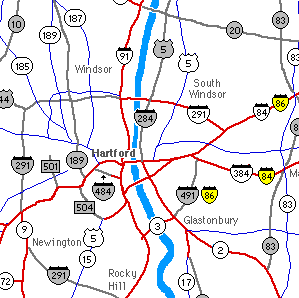 |
2000 Here, the map was completely redone in Adobe Illustrator.
Many advantages are apparent right away: antialiased fonts and lines,
interchanges, town lines and town names, and more local detail.
Using multiple layers and objects instead of a single layer of pixels made for more effective editing. Freeways even have line styles (bordered or multiline effect) as seen on professional maps. However, I didn't know the best technique for doing this, and actually used the paintbrush tool with a color fill and black stroke. If you look closely, some freeways don't have a perfectly smooth stroke or even a constant width (such as I-84 west of SR 501). At the outskirts of the map, freeways would have a rounded end. Also, I rendered the final image in JPEG, which was silly. | 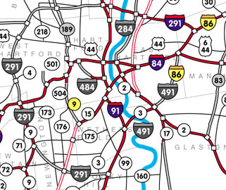 |
2004 Here's the newest map, drawn from the 2000 base, but substantially redone on
all layers. There are several improvements:
... and, the final map is rendered in PNG instead of JPEG. | 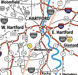 |